Create a custom icon set
This post is also available in:
Vivaldi introduces support for custom icon set for all toolbar buttons. Here’s how to best handle resources when creating your own icons.
Edit a theme
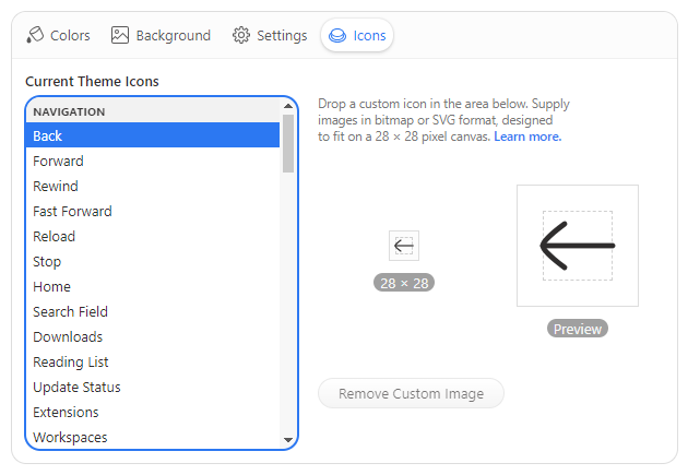
You can populate all the theme buttons right in the Vivaldi UI. To place your own icons, go to Settings > Themes > Editor > Icons to see a list of all available toolbar buttons sorted by category, and the interface to place your own icons. Custom icons will be included in an exported theme.
Image size
Vivaldi supports 28 × 28 pixels bitmap or SVG images in all toolbars. Larger images will be scaled to this size.
Icon layout
Vivaldi icon glyphs are sized at, or around 16 pixels. Your icon should leave margin around its edges, not filling the entire canvas, which can lead to big icons in a cramped toolbar. However feel free to use the available room for shapes spanning outside the imaginary boundary, or for bigger icons.
Suggested icon placement on canvas
Bitmap resources
Vivaldi supports bitmap images in GIF, JPG, JPEG, PNG, and WEBP format. Consider using a format that supports the alpha channel mask. Icons should maintain sufficient contrast against both light and dark background colors, as your theme icon set can be used in other themes as well.
Bitmap resources are best exported at double their target size to render sharply on high DPI displays and to leave room for UI scaling, i.e. export images at 56 × 56 pixels to double the resolution of the 28 pixel target.
SVG resources
Aside of bitmaps, Vivaldi supports the Scalable Vector Graphic (SVG) format, which may be produced in a few different ways.
If you’d like your icon to inherit current theme colors, do not use any fill color definitions, or use the currentColor keyword. That ensures proper color inheritance in all the different toolbar and theme combinations.
<svg
  xmlns="http://www.w3.org/2000/svg"
  viewBox="0 0 28 28"
  fill="currentColor"
>
  <!-- inherits fill color from current Vivaldi theme -->
  <path d="..." />
  <!-- uses specific fill color -->
  <path d="..." fill="#ffeea8" />
</svg>
SVG color inheritance example
On the other hand you can control all stroke and fill colors locally, independent of current theme colors. In that case you want to ensure all colors are set, so as not to inherit unexpected theme colors.
<svg
  xmlns="http://www.w3.org/2000/svg"
  viewBox="0 0 28 28"
  fill="#000"
>
  <!-- inherits default fill color #000 specified above -->
  <path d="..." />
  <!-- uses specific fill color -->
  <path d="..." fill="#ffeea8" />
</svg>
SVG code example with own color definitions
Whether you choose to use fill or stroke-based icons is up to you. In the later case define stroke properties inline.
<svg
  xmlns="http://www.w3.org/2000/svg"
  viewBox="0 0 28 28"
  fill="none"
  stroke="currentColor"
>
  <!-- no fill; stroke color inherited from current Vivaldi theme -->
  <path
    d="..."
    stroke-width="1"
    stroke-linecap="round"
    stroke-linejoin="round"
  />
</svg>
Stroke-based SVG icon example
SVG filters and masks
Filters and masks in SVG are referenced by ID, which needs to be unique. If the ID is not unique, a reference to it could be lost, and the filter or mask will break. Maintaining a unique ID for the same filter across multiple files is tedious and won’t prevent ID duplicity in the Document Object Model (DOM).
To overcome the potential issues, consider flattening the graphic instead of using masks, or replacing SVG filters with inline Cascading Style Sheets (CSS). For example to replace feDropShadow SVG glow effect:
<svg
  xmlns="http://www.w3.org/2000/svg"
  viewBox="0 0 28 28"
  fill="none"
  stroke="currentColor"
>
  <defs>
    <filter id="neonGlow-034">
      <feDropShadow
        in="enlarged"
        dx="0"
        dy="0"
        stdDeviation="40"
        flood-color="cyan"
      />
    </filter>
  </defs>
  <g filter="url(#neonGlow-034)">
    <rect x="7" y="7" width="14" height="14" rx="2" />
  </g>
</svg>
Original SVG filter
<svg
  xmlns="http://www.w3.org/2000/svg"
  viewBox="0 0 28 28"
  fill="none"
  stroke="currentColor"
>
  <g style="filter: drop-shadow(0, 0, 1px, cyan)">
    <rect x="7" y="7" width="14" height="14" rx="2" />
  </g>
</svg>
Similar effect achieved by inline CSS
Minimized SVG
It is good idea to minimize exported SVG icons with a tool such as SVGO. Your editor may also minimize SVG on export, but this may come with some caveats, such as maintaining unique IDs.
SVG file encoding
SVG files must be UTF-8 encoded. Import sanitation strips all JavaScript and <style> elements (inline style attributes are allowed).
Theme archive format
The current Vivaldi theme format was expanded to support icons for a growing number of toolbar buttons or command chains. Single icon resource is exported in a theme archive JSON as button ID and image path pair.
"buttons": {
  "buttonId": "imagefile01.png"
}
If you are batch-processing the icon images you may consider exporting your custom theme in Vivaldi and updating the images by replacing them in the resulting ZIP archive.
Figma template
If you want to start creating a new icon set based off the official Vivaldi UI icons, we have created a Figma template for the occasion. The URL to the template is https://www.figma.com/community/file/1214878626987427743.